How Web Design Shapes First Impressions Online
A first impression online forms faster than most business owners think. Before a visitor reads a headline, checks a review, or compares prices, the design of a website starts sending signals. Some are obvious, like whether the site looks modern or dated. Others are subtler, like whether the spacing feels calm, whether the buttons invite action, or whether the page seems trustworthy enough to justify another click.
People do not experience a website in neat categories. They do not consciously separate layout from typography, or color from credibility. They experience the whole thing at once. Within seconds, they decide whether the business feels competent, relevant, and worth their time. That judgment may not be perfectly fair, but it is real, and it affects sales, leads, bookings, and phone calls every day.
That is why web design matters far beyond aesthetics. It shapes perception before a conversation even starts.
The design speaks before the copy does
I have seen businesses invest heavily in strong services, thoughtful messaging, and smart offers, only to lose momentum because the site itself undermined confidence. A law office with a cluttered homepage looks less reliable, even if the attorneys are excellent. A remodeling company with grainy photos and tiny text seems less established, even if their workmanship is exceptional. A local med spa with a polished, intuitive site often earns more inquiries than a competitor with similar pricing, simply because visitors feel more at ease.
Design acts as a form of nonverbal communication. In person, people notice posture, eye contact, grooming, and tone of voice. Online, the equivalents are visual hierarchy, image quality, page speed, readability, and overall cohesion. A website can say, “We pay attention to detail,” or it can say, “We have not updated this in years.” Most visitors will never phrase it that directly, but their behavior reveals the judgment. They stay, click, and convert, or they leave.
This is especially important for service businesses. When someone cannot inspect your work immediately, the website becomes the stand-in for your standards. If the design feels careless, people assume the experience may be careless too.
Visitors make emotional decisions first, rational decisions second
Business owners often want a site that “has all the information.” Information matters, but it is rarely the first filter. Emotion gets there first. Trust, clarity, comfort, interest, and even relief are often what determine whether someone keeps reading.
A good design lowers friction. It answers quiet, immediate questions that visitors ask almost instinctively. Am I in the right place? Can I trust this company? Is this going to be easy? Do they understand what I need? If those questions are answered quickly, the visitor settles in. If they are not, even strong copy can go unread.
This is one reason clean layout works so well. It does not simply look better. It reduces cognitive strain. When people do not have to hunt for the menu, squint at text, or decode a chaotic homepage, they feel more confident. Confidence creates momentum. Momentum creates action.
I have watched this happen with small business websites repeatedly. A redesign does not always require dramatic changes in offer or traffic source. Sometimes the same business, same audience, and same ad budget produce better results because the site feels easier to trust. That trust can be the difference between a bounce and a booked consultation.
Credibility is often visual before it is verbal
There is a common mistake in website design for small business: treating trust as a purely content problem. Owners add testimonials, certifications, guarantees, and FAQs, which can all help, but if the site itself feels flimsy, those trust elements lose power.
Visual credibility depends on consistency. Fonts should work together. Colors should support the brand and guide attention. Photos should feel current and professional. Spacing should create order. Buttons should look clickable. The mobile version should not feel like an afterthought. When those elements align, visitors interpret the business as more established and more careful.
The opposite is just as powerful. A site with five font styles, misaligned sections, stock photos that feel generic, and weak contrast does more damage than many owners realize. It may still function, technically speaking. But function alone is not enough when first impressions are being formed at speed.
This matters even more in competitive local markets. If someone compares three businesses in the same area and two have polished, easy-to-use websites while one feels old and confusing, the weaker site starts the conversation at a disadvantage. It has to work harder to earn the same level of trust.
Good design makes businesses look more expensive, and often more valuable
Price perception is heavily influenced by presentation. This is not manipulation. It is context. People expect a premium experience to look premium. If a business charges above-average rates, the website must support that positioning. If it does not, visitors feel tension. They may not know exactly why, but they sense a mismatch between what is being asked and what is being presented.
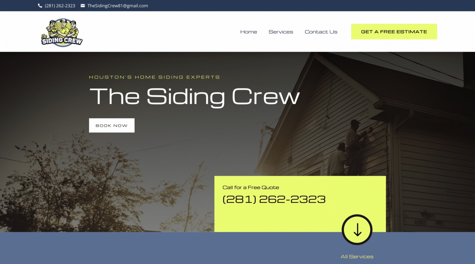
A polished site can justify stronger pricing by making the business feel more organized, more selective, and more professional. This applies to consultants, contractors, clinics, salons, agencies, and retailers alike. The design sets expectations about the quality of the experience to come.
I once saw a local home service company raise the perceived value of its brand without changing the service package at all. The old site looked assembled over many years, with inconsistent colors, awkward image cropping, and walls of text. The updated version used cleaner photography, better spacing, stronger calls to action, and a clearer structure. Leads did not just increase. The quality of leads improved. More visitors came in already believing they were dealing with a serious company.
That is what design can do when it aligns with business goals. It attracts not just attention, but the right kind of attention.
The fastest way to lose a visitor is confusion
A website does not have to be ugly to fail. It can fail by being confusing. Confusion quietly kills conversions because it interrupts decision-making. Visitors hesitate when they cannot tell what the company does, who it serves, where to click next, or how to get help.
Homepages often carry too much weight. Owners want to say everything at once, so they crowd the page with service lists, animations, testimonials, promotions, and paragraphs of background. The result is a site that tries to do too much and guides too little.
Clarity usually beats cleverness. A visitor should be able to understand the business, the value proposition, and the next step almost immediately. That does not mean a site has to be plain or generic. It means the design should support understanding rather than compete with it.
This is where strong hierarchy matters. Bigger, bolder elements should signal what matters most. Secondary details can sit lower on the page or in supporting sections. Visual rhythm should help people move naturally. When every element shouts, nothing gets heard.
Mobile design now shapes the dominant first impression
For many businesses, the first visit happens on a phone. That changes the standard completely. A website that looks fine on a laptop can feel frustrating on mobile if the text is cramped, buttons are hard to tap, or images push key information too far down the page.
Mobile design is not just responsive resizing. It is prioritization. On a smaller screen, every choice becomes more important. The visitor is usually in a faster, more distracted context. They may be standing in a parking lot, checking business hours, comparing options between appointments, or trying to contact someone quickly. If the mobile experience feels awkward, they rarely give the benefit of the doubt.
For website design for small business, this is one of the biggest missed opportunities. Many owners review their site on a desktop during the build process, then assume the mobile version will take care of itself. It rarely does. Good mobile design requires deliberate choices about button placement, scrolling flow, load speed, and what deserves prime space above the fold.
When businesses fix mobile friction, they often see immediate gains. Click-to-call rates improve. Forms get completed more often. Bounce rates fall. None of that is mysterious. The site simply stops getting in the visitor’s way.
Speed is part of design, whether people realize it or not
Design is often treated as what visitors see. In practice, it also includes what they feel while waiting. A slow website feels less professional. It creates subtle doubt. If a page takes too long to load, many users leave before they have seen the design at all.
People do not separate performance from brand perception. They experience them together. A sleek homepage loses impact if the hero image stalls on a weak connection. An elegant booking page stops feeling elegant when it lags between steps.
This is one of the trade-offs that experienced designers think about constantly. Large images can create atmosphere and emotional pull, but they need to be optimized. Motion can add polish, but too much can drag performance and distract from the message. Custom flourishes can differentiate a brand, but they should never come at the cost of usability.
The best sites balance beauty with restraint. They know where visual drama helps and where simplicity wins.
Local businesses feel this even more sharply
For local companies, first impressions often happen in a high-intent moment. Someone is not browsing casually. They need a roofer, dentist, accountant, personal trainer, or boutique hotel, and they need enough confidence to take the next step. In those cases, the website often serves as the deciding factor between several similar options.
This is easy to see in competitive areas where many providers offer overlapping services. A search for web design The Woodlands, for example, can pull up agencies and freelancers with different levels of sophistication. Prospects may not be equipped to judge technical skill directly, so they use the website itself as evidence. If a web design company cannot present its own brand clearly, visitors wonder how well it can handle theirs.
That same logic applies across industries. A visitor may not know how to evaluate plumbing systems, tax strategy, or skin treatments in depth, but they know how a website makes them feel. If the design feels polished, current, and easy to use, the business gets a head start. If not, it begins with skepticism.
For small businesses trying to grow in local markets, that head start matters. It affects not just conversions, but referrals, ad performance, and how people talk about the brand.
Strong web design reduces the need to “sell harder”
One of the quiet benefits of a well-designed website is that it eases pressure on every other part of marketing. Ads perform better when the landing page feels credible. SEO traffic converts better when visitors can find answers quickly. Social traffic stays longer when the site reflects the same quality as the posts that brought them there.
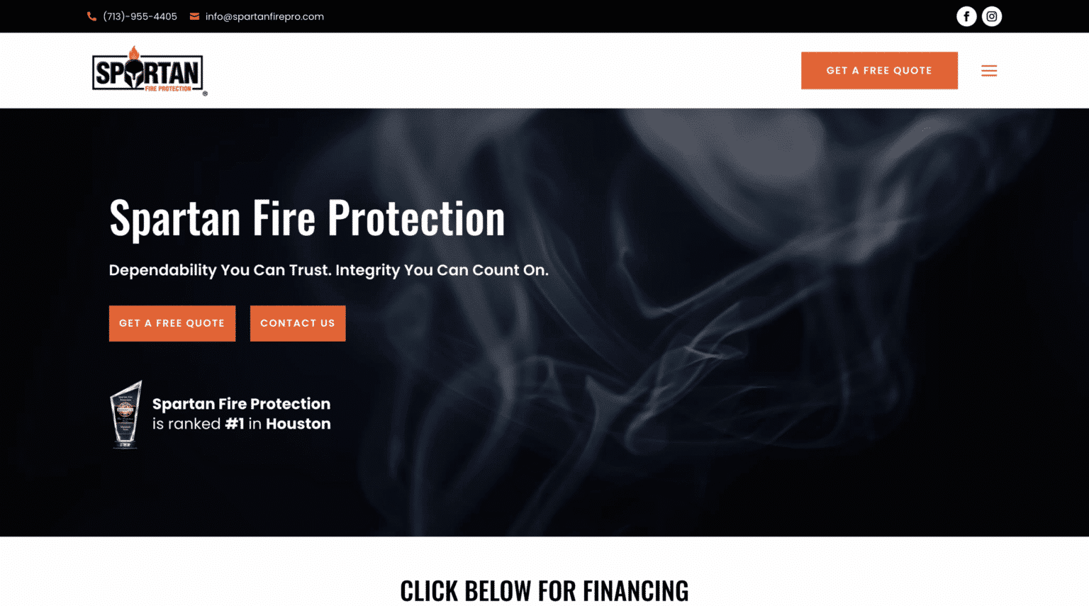
Poor design creates drag everywhere. Businesses then compensate by writing longer copy, offering steeper discounts, or pushing more follow-up. Sometimes that works, but often it is an expensive way to solve the wrong problem.
A better website does not replace web design Scalable Websites good marketing, but it gives good marketing somewhere to land. It turns interest into confidence. It turns confidence into action.
In practice, that can mean a shorter sales cycle. People arrive more pre-sold when the website has already communicated professionalism, fit, and competence. Calls go better when the prospect has already seen clear service pages, recognizable proof, and an easy process. Sales teams spend less time overcoming uncertainty that the website accidentally created.
What visitors notice, even when they cannot name it
Most people are not design critics. They will not say your spacing is inconsistent or your visual hierarchy is weak. They will say the site felt confusing, old, hard to use, or somehow off. That “somehow” usually comes from a cluster of small design choices.
A few elements tend to have outsized influence on first impressions:
- Typography that is easy to read and suited to the brand
- White space that gives the page room to breathe
- Imagery that feels real, relevant, and high quality
- Navigation that makes sense immediately
- Calls to action that stand out without feeling desperate
None of these elements works in isolation. Together, they create a sense of confidence. When they are neglected, the site feels less trustworthy, even if the business itself is excellent.
This is why template-only thinking can fall short. Templates can be useful starting points, especially for budget-conscious businesses, but they do not automatically produce strong first impressions. Without careful adaptation, many template sites end up feeling generic, crowded, or disconnected from the business behind them.
Design choices should reflect business reality, not trends alone
It is tempting to chase design trends because they can make a site look current. Sometimes that is worthwhile. Sometimes it backfires. Trend-heavy websites can age quickly, and certain visual styles work poorly for audiences who value clarity over novelty.
A high-end interior designer may benefit from a more editorial, image-led site. A family law firm may need something calmer, more grounded, and more direct. A pediatric clinic should not feel like a nightclub, and a craft coffee brand should not look like a municipal utility. Good design reflects the character of the business and the expectations of the customer.
This is where professional judgment matters. The right website is not the one with the most effects or the most stylish references. It is the one that creates the right first impression for the people you actually want to serve.
I have seen businesses hurt themselves by copying competitors that looked impressive but were built for a different market position. A startup with a modest service range adopted the visual language of a national luxury brand, and the result felt inflated rather than credible. The site looked expensive, but the supporting content and offer could not carry the same weight. Visitors sensed the mismatch. Design should elevate reality, not fight it.
When a redesign is worth it
Not every website needs a full rebuild. Sometimes stronger photos, cleaner copy, and better page structure are enough to improve first impressions significantly. But there are clear signs that design is actively holding a business back.
- The site looks dated compared with local competitors
- Mobile users struggle to navigate or contact the business
- Bounce rates are high on key landing pages
- Leads are low despite decent traffic
- The business has evolved, but the website still reflects an older version of the brand
In those cases, redesign is not cosmetic. It is strategic. It can sharpen positioning, improve conversion paths, and bring the digital experience in line with the quality of the actual service.
For owners considering website design for small business, the right question is not “Do I need something prettier?” It is “Does my site create confidence fast enough?” If the answer is no, design deserves serious attention.
The website is often the handshake before the handshake
A website has a difficult job. It must greet strangers, signal competence, reduce doubt, and guide action, often in less than a minute. That is why first impressions online carry so much weight. People do not simply visit websites. They size up businesses through them.
When the design is thoughtful, the visitor feels that thoughtfulness. When it is sloppy, they feel that too.
Good web design does not guarantee trust, but it earns the chance to deepen it. It opens the door. It gives your words, your reviews, your portfolio, and your offer the environment they need to work. In crowded markets and short attention spans, that advantage is hard to overstate.
The businesses that win online are not always the loudest. Often, they are the clearest. Their websites make a strong first impression because every design choice reinforces the same message: we know what we are doing, and working with us will feel straightforward.
That message lands before a form is filled out, before a call is made, and before a sale is ever discussed. And once it lands, everything that follows gets easier.
Scalable Websites
Website design for contractors and small businesses
Based in Montgomery, TX, serving Montgomery County and greater Houston
Phone: (832) 979-2478
Website: scalablewebsites.com
Hours: Monday to Friday, 8 AM to 5 PM
Scalable Websites builds and manages mobile-first websites for contractors and small businesses on simple monthly plans, with hosting, security and unlimited updates included. Find us on Google.